I first came across Richmond’s Hope when I was looking for support for my young children after their daddy’s sudden death.
Richmond’s Hope is an Edinburgh- (and now Glasgow-) based charity, who make a difference to the lives of bereaved children and young people aged 4-18. They have provided support through both individual and group sessions to both of my children over the years, and have given invaluable feedback and input into the development of my books.
When they were looking for a new corporate identity, I was excited to be able to help.
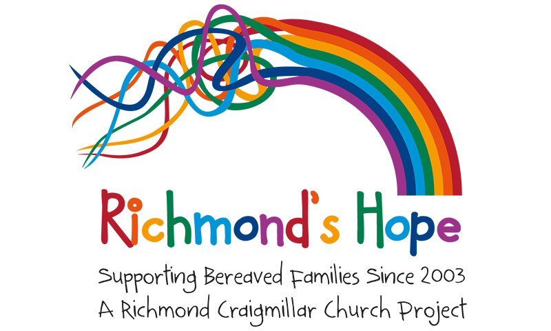
I developed the “muddled rainbow” logo – each colour representing one of the main feelings grieving children deal with – “angry”, “sad”, “guilty”, “happy”, “worried”, “scared” and “mixed up”, which, at first, can be overwhelming and confusing, but with time and a little bit of guidance can be accepted as part of a new life, hence forming the beautiful rainbow.
This new logo is colourful, friendly, calming and gender-neutral, and appeals equally to all ages. It is supported by a friendly font – the typography picking up on the colours of the rainbow.
I then developed signage, stationery, leaflets, a folder and pop up banner stands for exhibitions.

