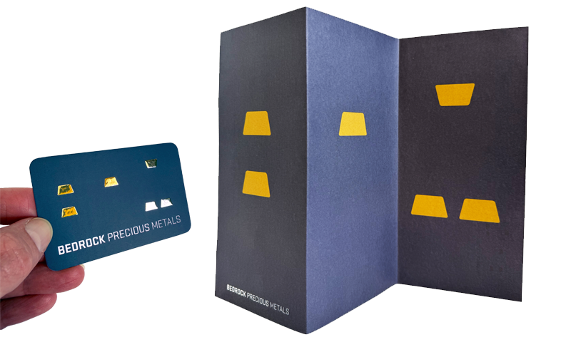
The logo icon for Bedrock Precious Metals features six small gold bars which are cleverly positioned to hint at the negative space within the company name’s initials – B, P and M, combined with bold typography for the logotype.
The company owner was looking for a stylish, well established and reliable feel for his new corporate identity, which is reflected in the choice of brand colours, and further underlined by the gold foil blocking on the business cards, adding a luxurious feel to the brand. The slightly raised nature of the foil blocking combined with the curved corners of the business card makes these cards both tactile and memorable.
The back of the letterhead features an oversized logo icon, separating it into its three initials – B, P and M, which makes it stand out from the moment it is pulled from an envelope, but also adds as a folding guideline for the sender.